As a part of the programme at Goldsmiths, I was tasked to design a user-friendly, printed map of RHB, aiding new students in locating their classrooms by representing all floors of the RHB on a single page, ensuring the map’s practicality and ease of use.
I redesigned the map of Richard Hoggard Building (RHB) based on user interviews and map design principles.
My Role Information Designer
Deliverables Map Design in A3 size
Tools Figma
Challenge
I was tasked to redesign the map for all three floors in three days.
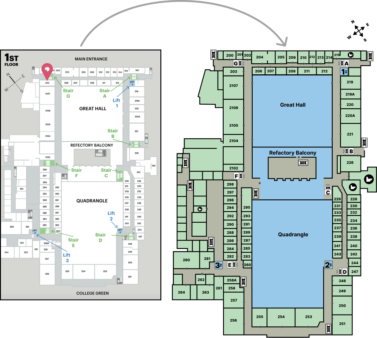
Here is the initial map:
Execution
Based on user interviews with new students, it was evident that inefficiencies in the current map were a significant concern, often leading to late arrivals for class:
There was difficulty in identifying the correct entrance due to a lack of clear markings.
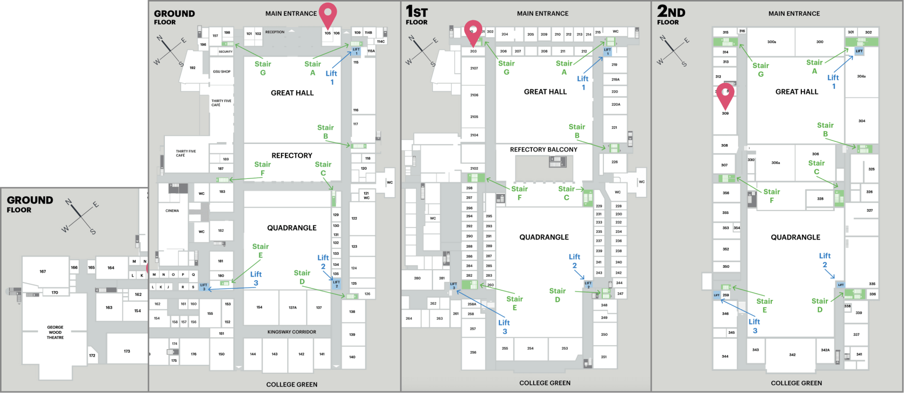
The full view of the ground floor map is separated due to the larger area of the buildings, resulting in some buildings being cut off from visibility.
There is lack of clear and distinct iconography, making it unclear and difficult to identify wheelchair-accessible areas, water taps, food services, and washrooms.
Additionally, there is difficulty in identifying key halls quickly due to a lack of contrasting colours, hindering at-a-glance recognition.
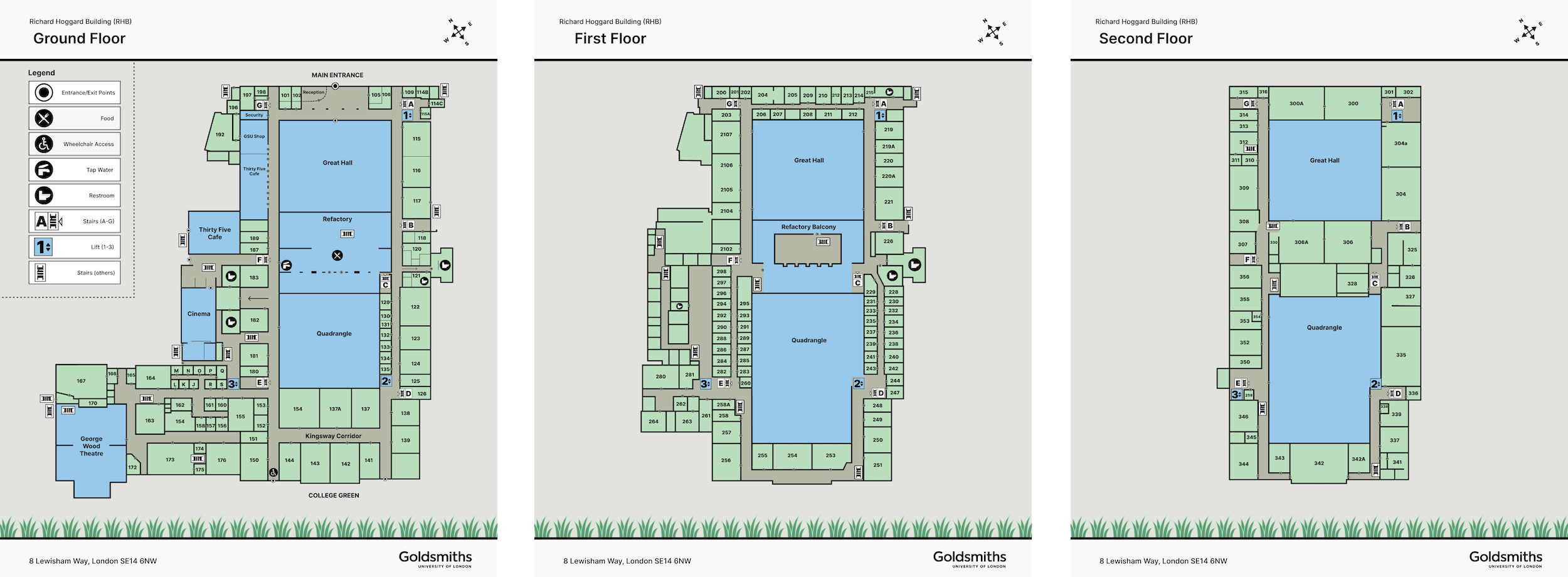
So, based on all the information using map design principles, I designed the following maps separately for all three floors.
Outcome
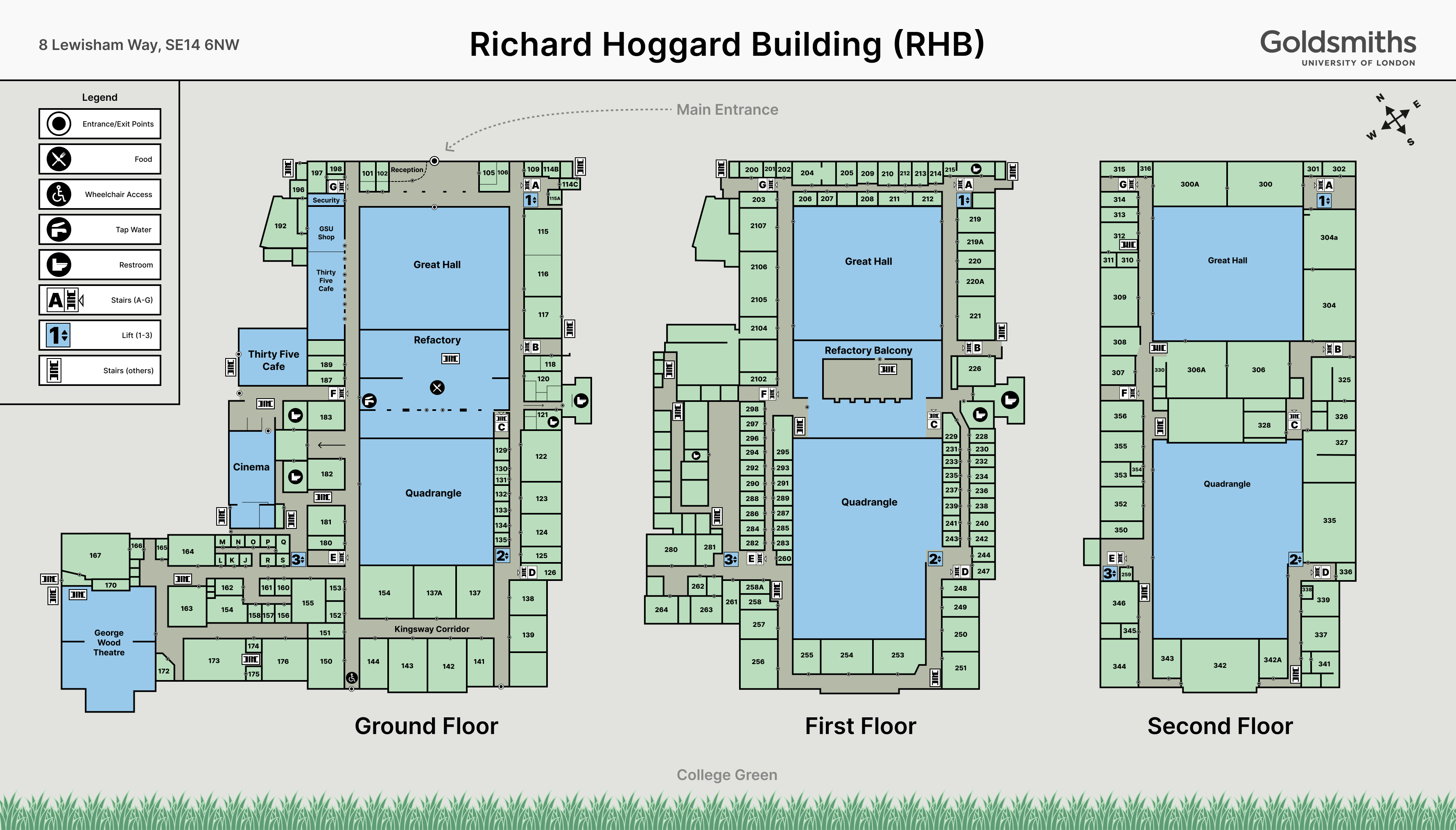
An A3-sized map combining all three floors of the RHB Building.
Reflection
It was an interesting project because map designs aren’t something I’m accustomed to.
But I took it like any other visual design task by trying to make the map as easily skimmable as possible.
I struggled with the icons as I needed to fit them into small areas while trying my best to make them recognisable. I believe there’s a lot of room for improvement in that area.