As part of the programme at Goldsmiths, we were tasked to design the information architecture by simplifying & enhancing the user experience of users with special dietary requirements who may be vegan, lactose intolerant, require halal food, or have other specific dietary needs.
I created the visual design of the Information Architecture (IA) for Just Eat.
My Role Visual Designer, UX Researcher
Team 1 Visual Designer, 5 UX Researchers
Deliverables Information Architecture in A4 size
Tools Figma, Miro, Optimal Workshop
Challenge
It was a two-hour project where we needed to recruit participants to participate in the card sorting activity and then conduct tree-testing for optimal website navigation.
We were then given a couple of days to create a visual representation of the information architecture.
Execution
I, along with a team of four others, adopted the following approaches to come up with an optimal categorisation.
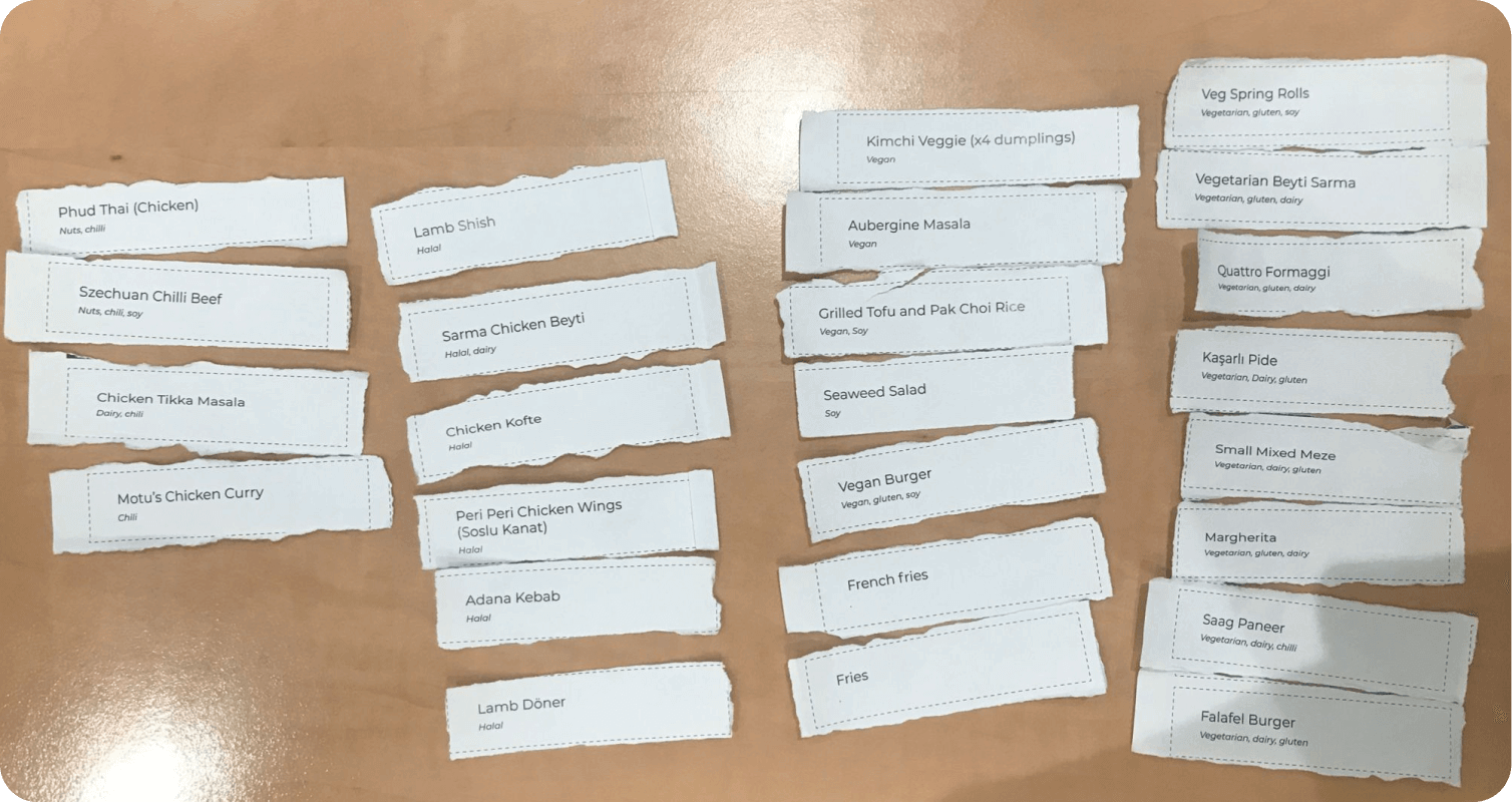
Open Card Sorting: We began with an open card sorting exercise where we grouped various food items into distinct categories. We decided based on the simplicity and clarity it would offer to our users.
Closed Card Sorting: We then moved to a closed card sorting exercise where we tested our categories with individuals from other teams, giving us an external perspective and allowing us to understand potential gaps or improvements.
Hierarchy Creation: Based on the insights gathered from the previous methodologies, we established a structured hierarchy for the food delivery app, ensuring the navigation was intuitive and user-friendly.
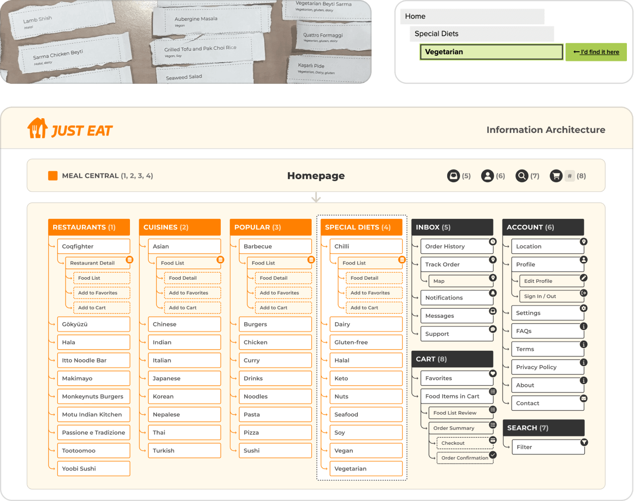
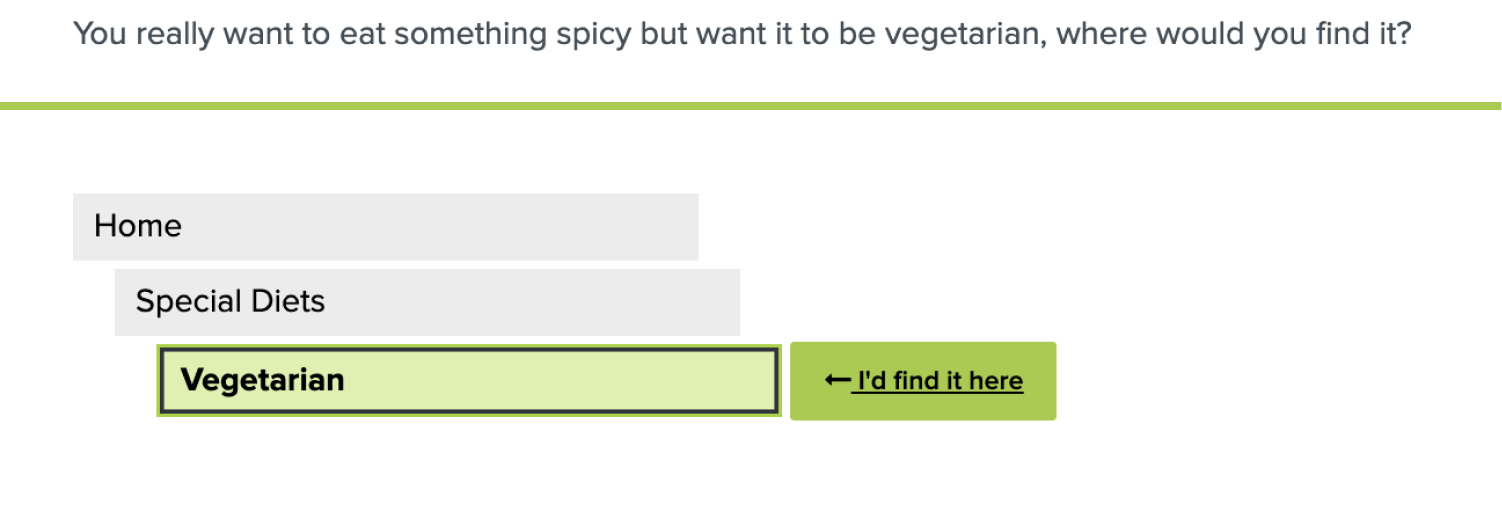
Tree Mapping and Testing: We built a tree map on Optimal Workshop and prepared it for a Treejack test with two real-life scenario-based tasks to test our structure.
User Testing: We had our Treejack study tested by another team to assess its usability and intuitiveness.
Result Analysis: Finally, we reviewed the results and discussed the necessary modifications to our proposed hierarchy to optimize the user experience.
Outcome
A modular-style A4-sized Information Architecture that adheres to design principles and ensure clarity and intuitiveness.
Reflection
After the insights from research, it was time to put my visual design skills to the test.
Rather than creating a standard information architecture, I drew inspiration from familiar web interfaces we are used to seeing.
I used JustEat’s brand colours to differentiate between two core sections: Meals and Account.
This wasn’t derived from UX research but through numerous visual design iterations.